DownUnder
DownUnder Merch is an Australian lifestyle brand bridging the rugged essence of the outback with modern sophistication. Offering premium apparel and accessories, the brand connects authenticity and global appeal.
Brand
DownUnder
Category
Fashion & Beauty
Country
Australia
Year
2024
About Project
DownUnder Merch approached us to develop a visual identity that reflects the untamed spirit of Australia while resonating with a global audience. Positioned in the lifestyle and apparel market, the brand needed an identity that balanced authenticity, modernity, and sophistication. The challenge was to encapsulate the essence of the Australian outback while creating a polished visual language that appeals to contemporary consumers worldwide.
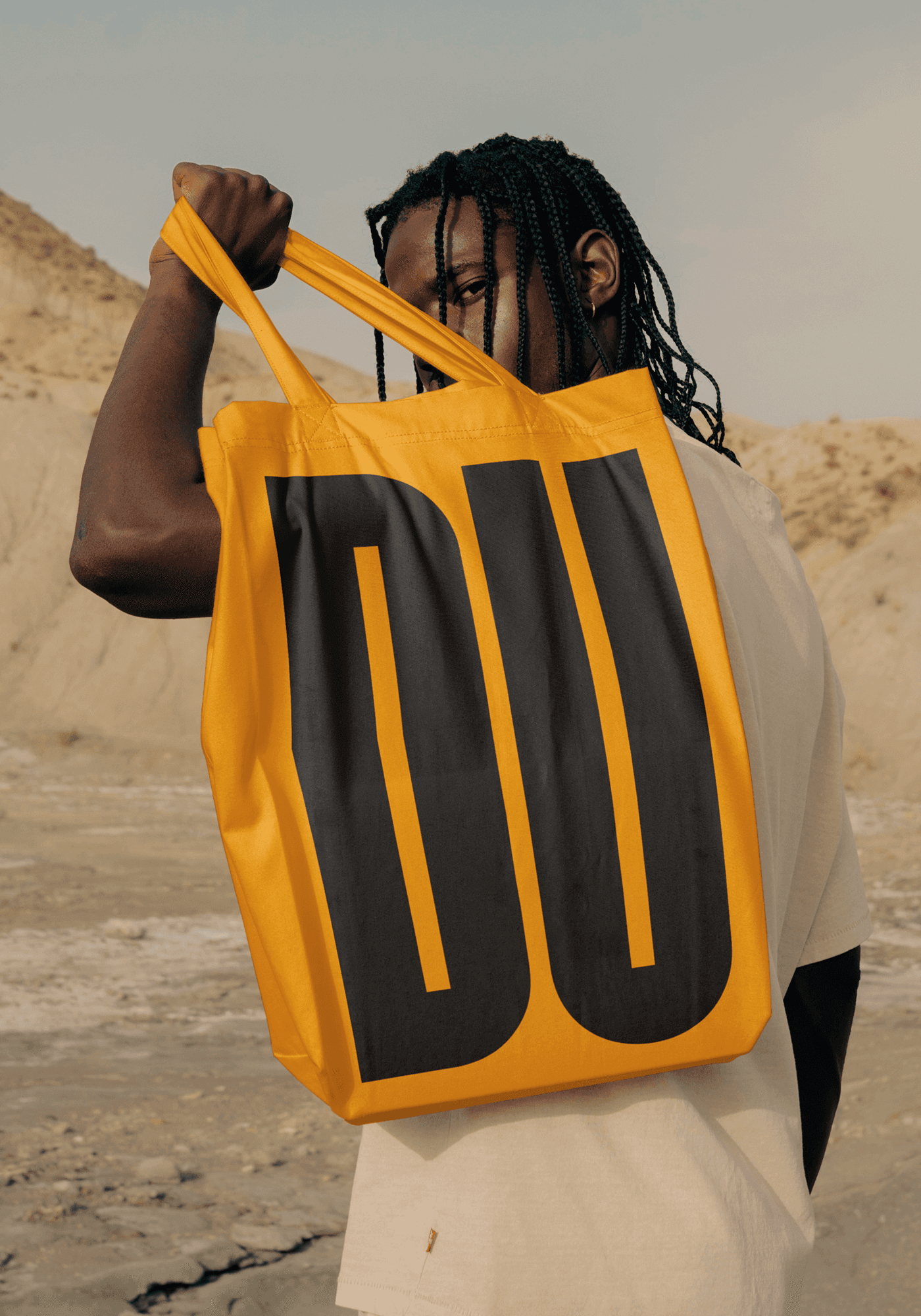
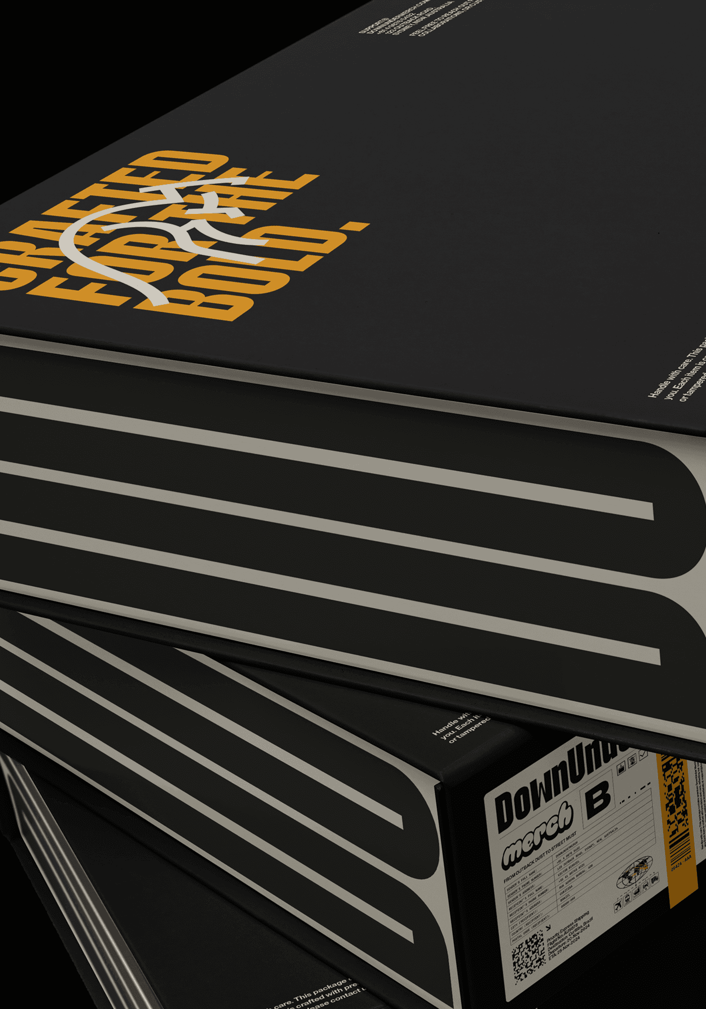
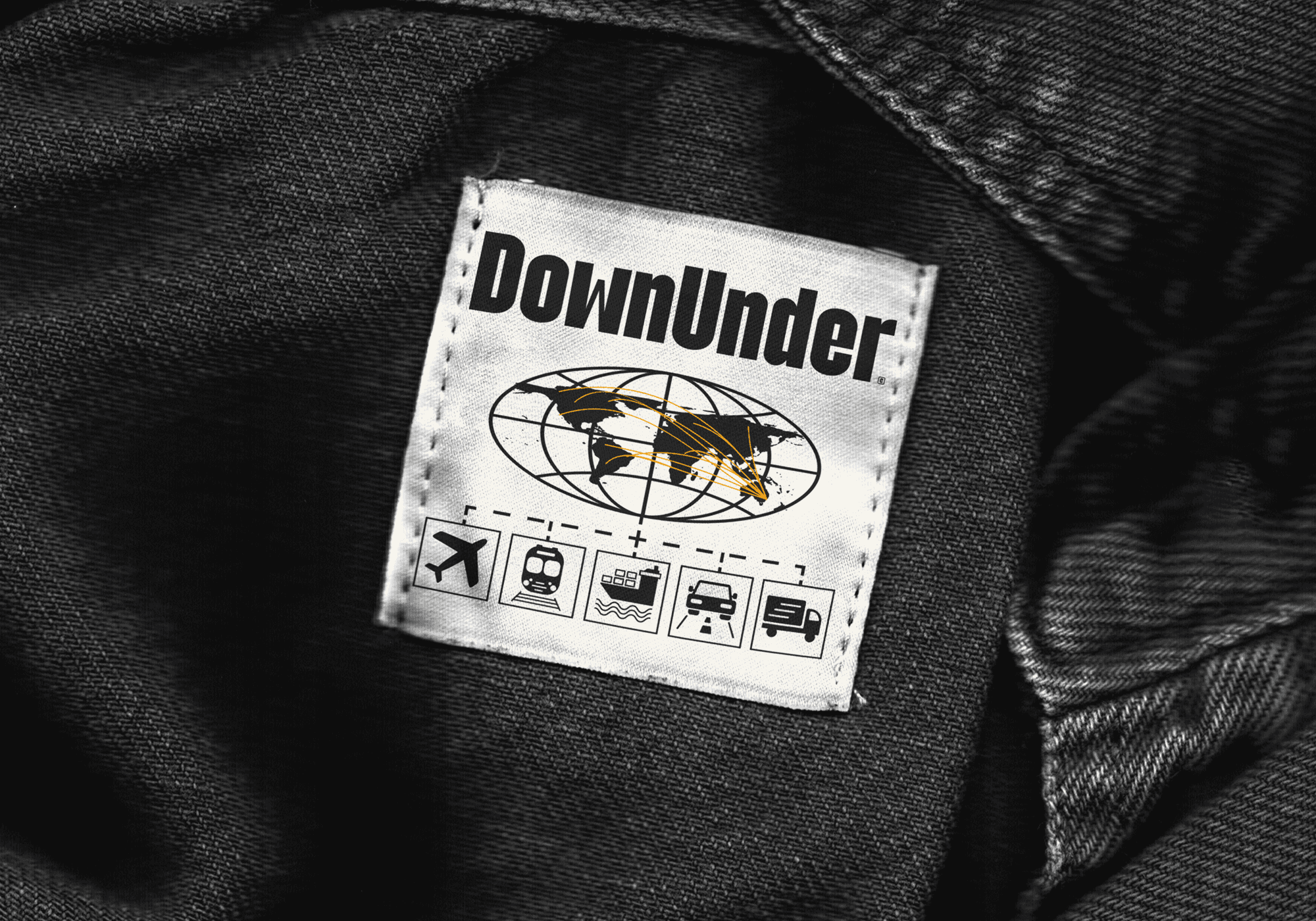
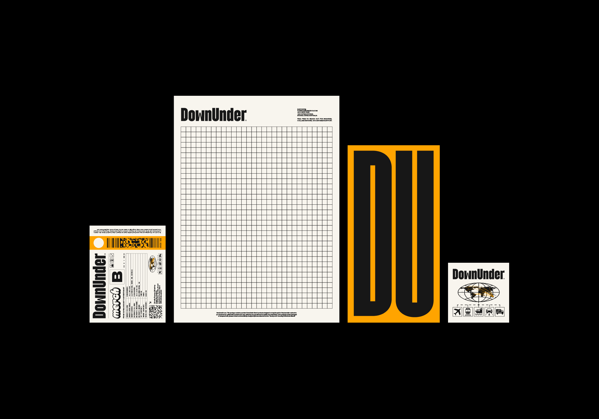
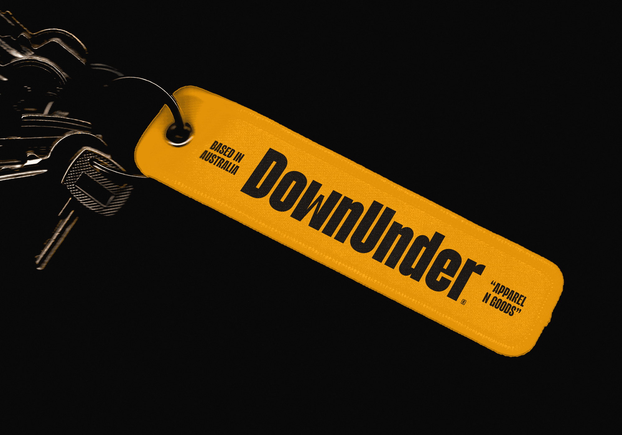
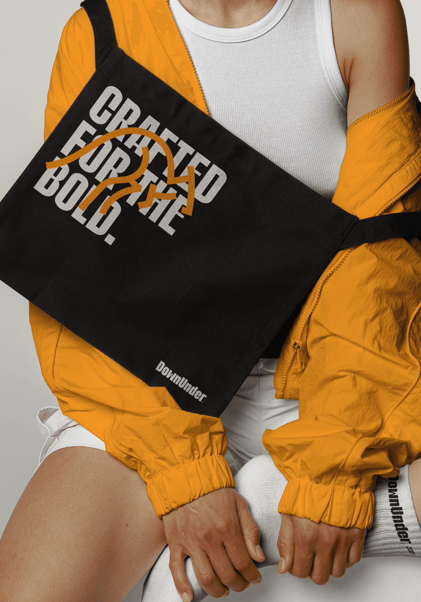
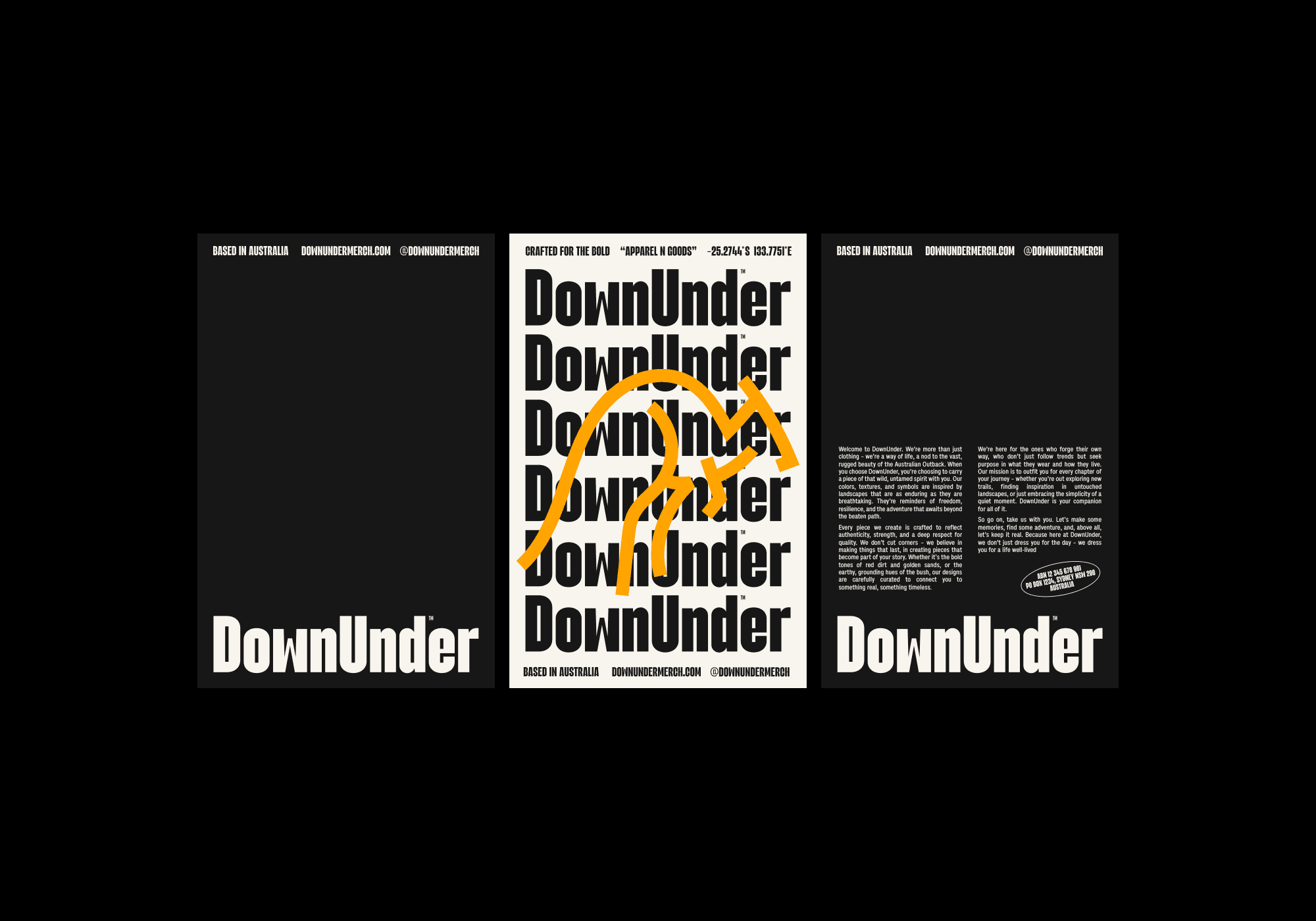
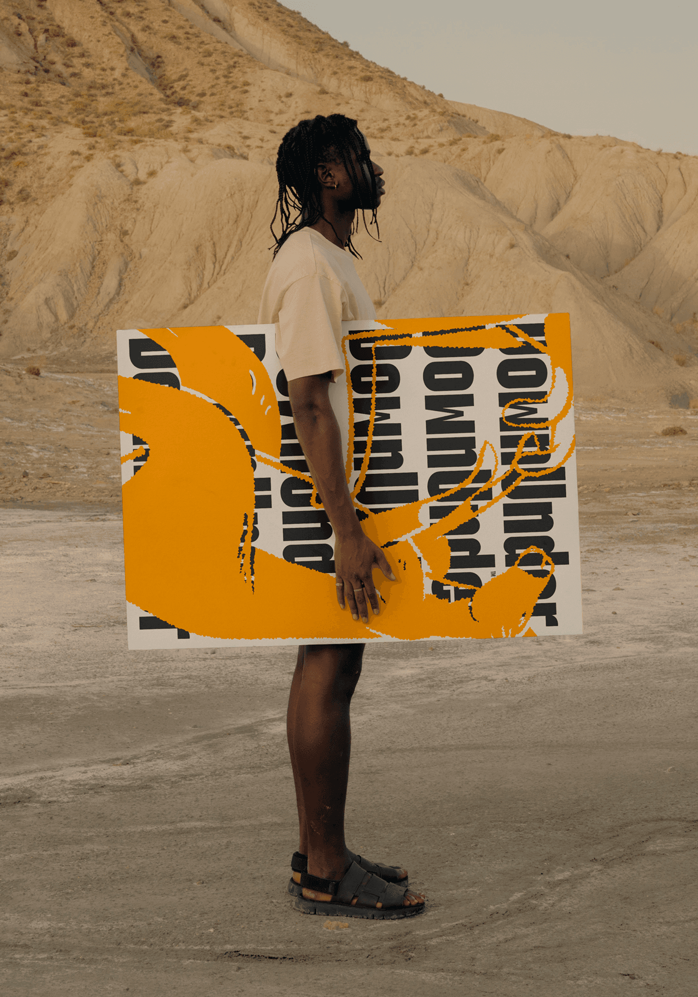
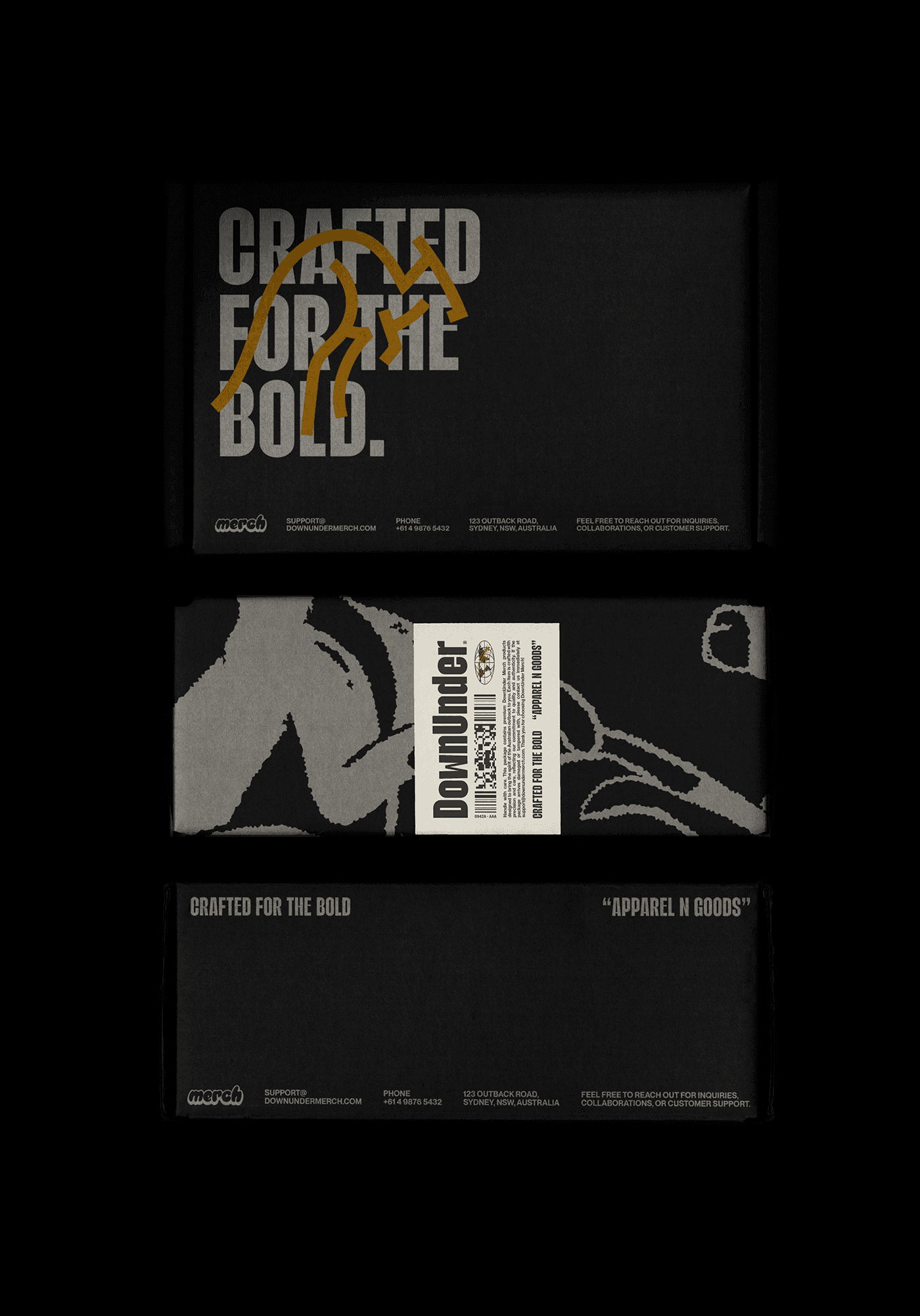
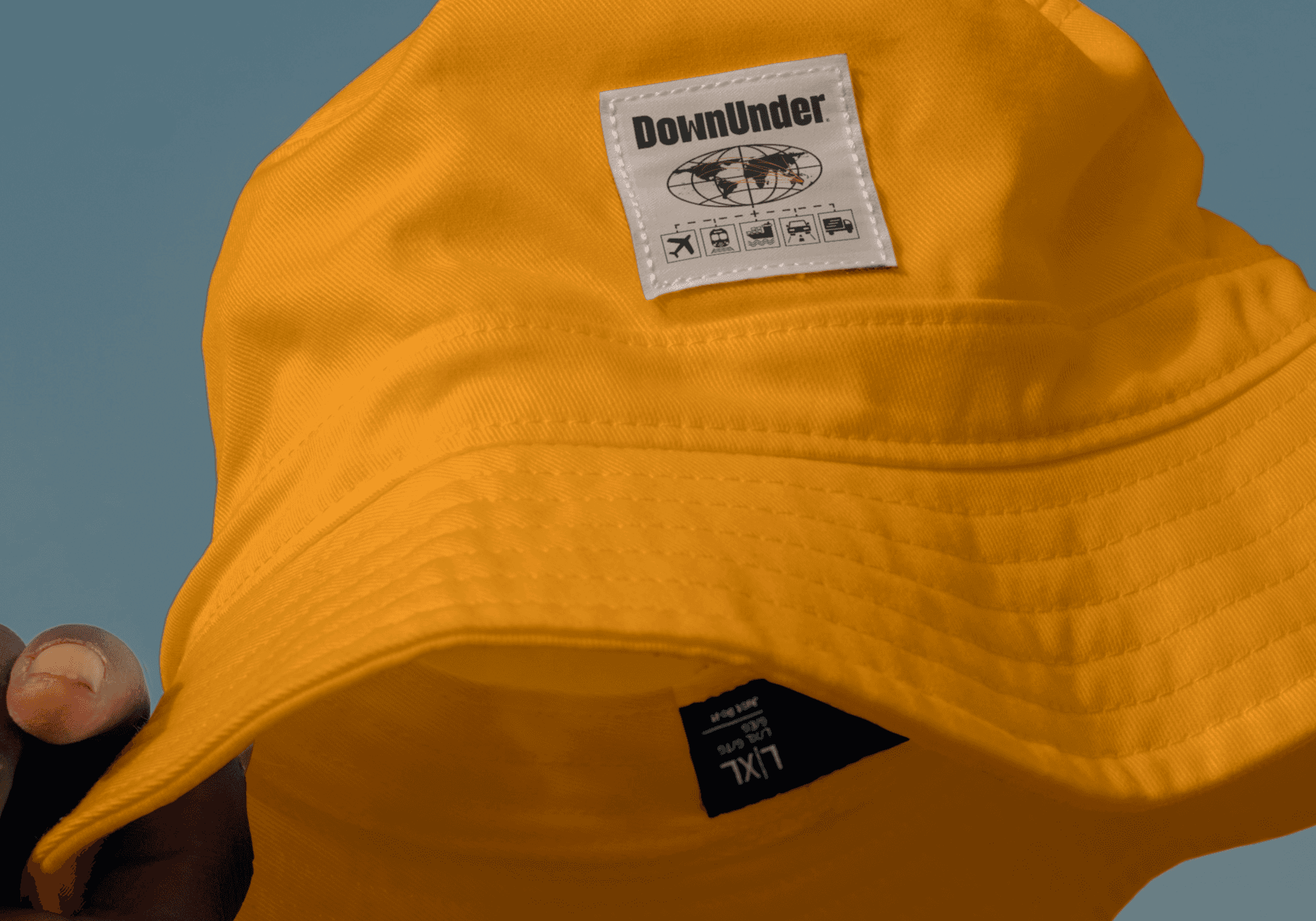
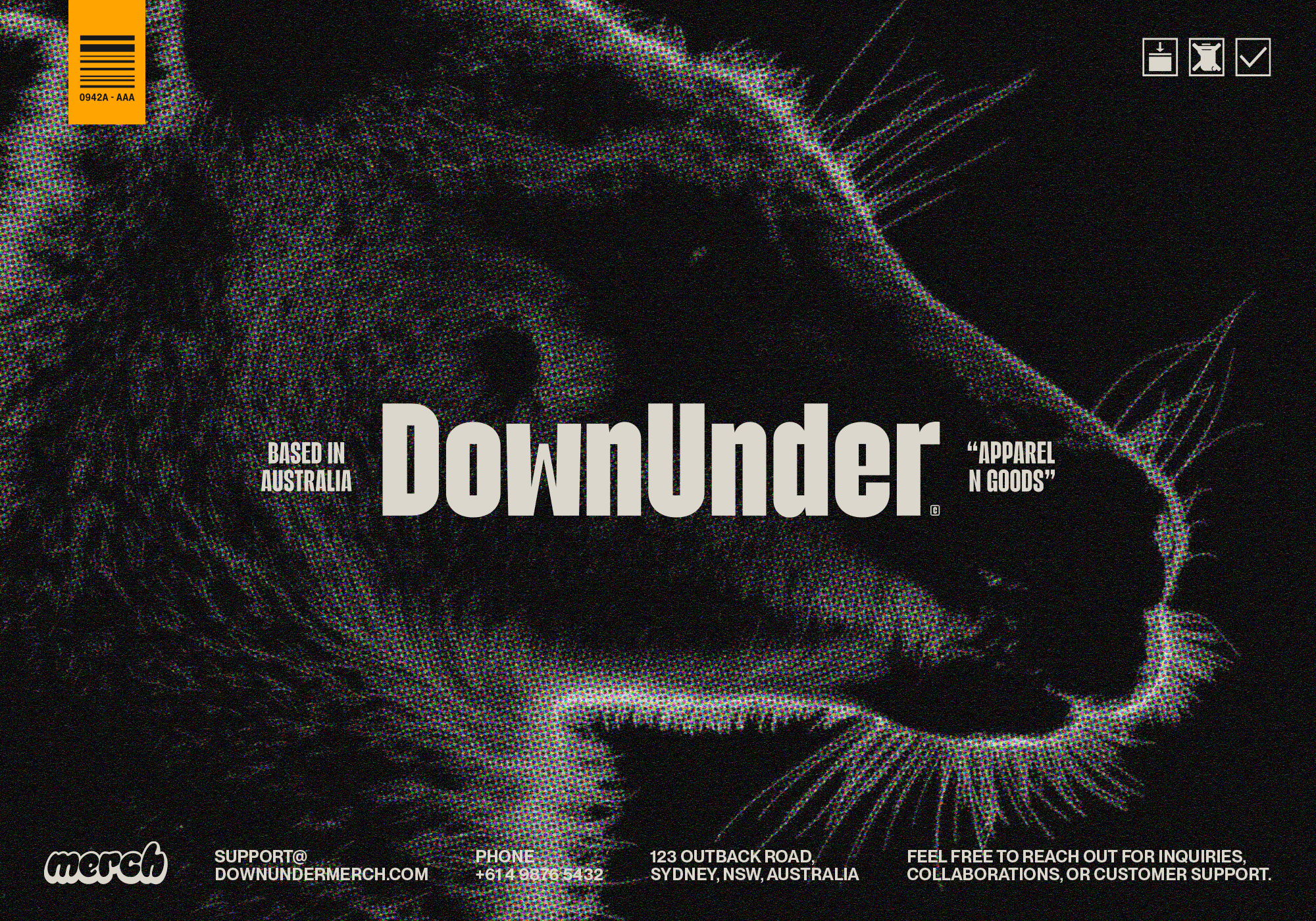
The creative process began with extensive market research and an exploration of the client’s vision. We identified key opportunities to differentiate DownUnder Merch through its deep connection to Australian heritage. This led to the development of a bold logotype with balanced proportions, designed for adaptability across various applications. The logotype was complemented by a distinctive kangaroo symbol, which represents strength, agility, and authenticity, and functions both as a logo mark and a graphic element.
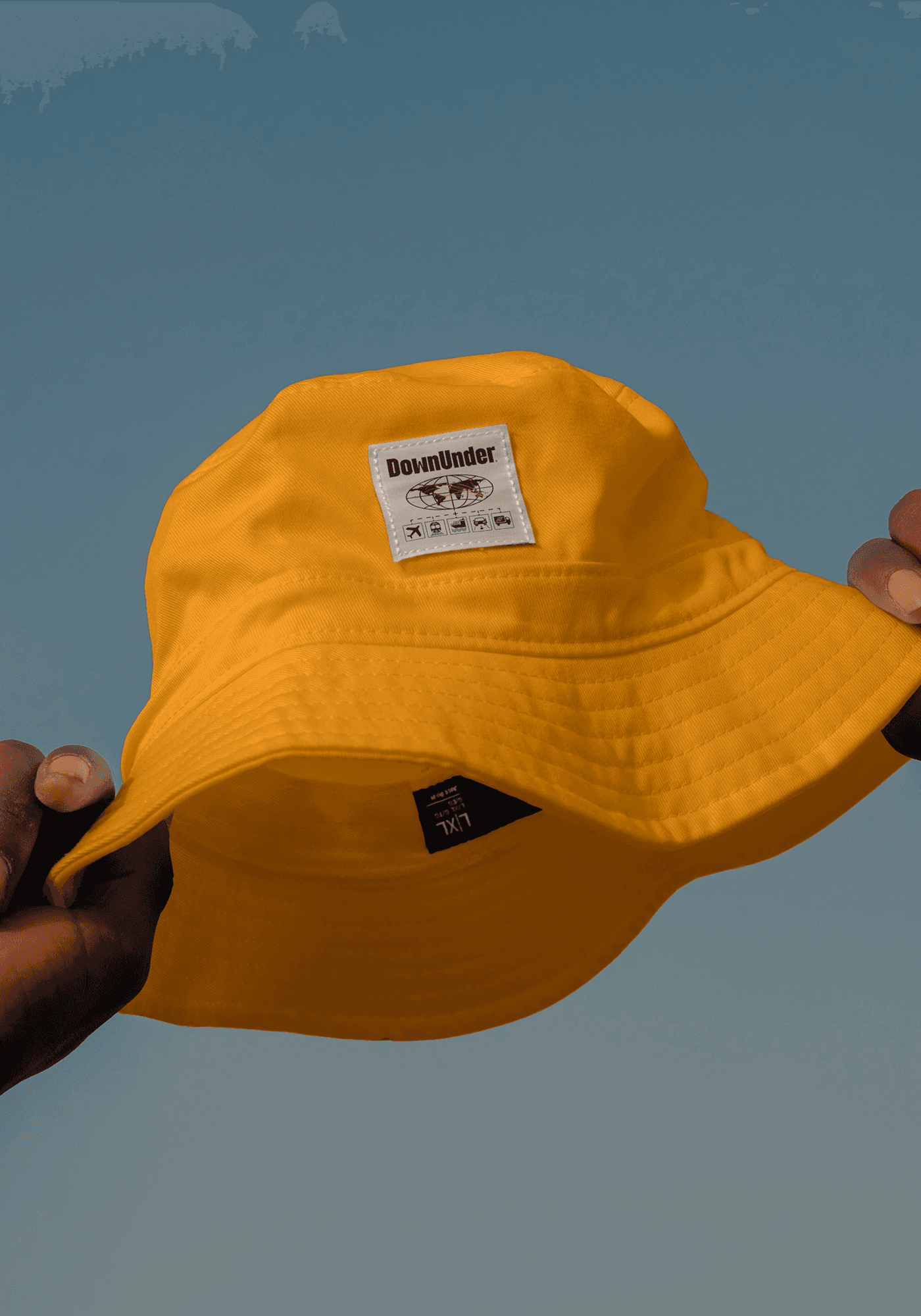
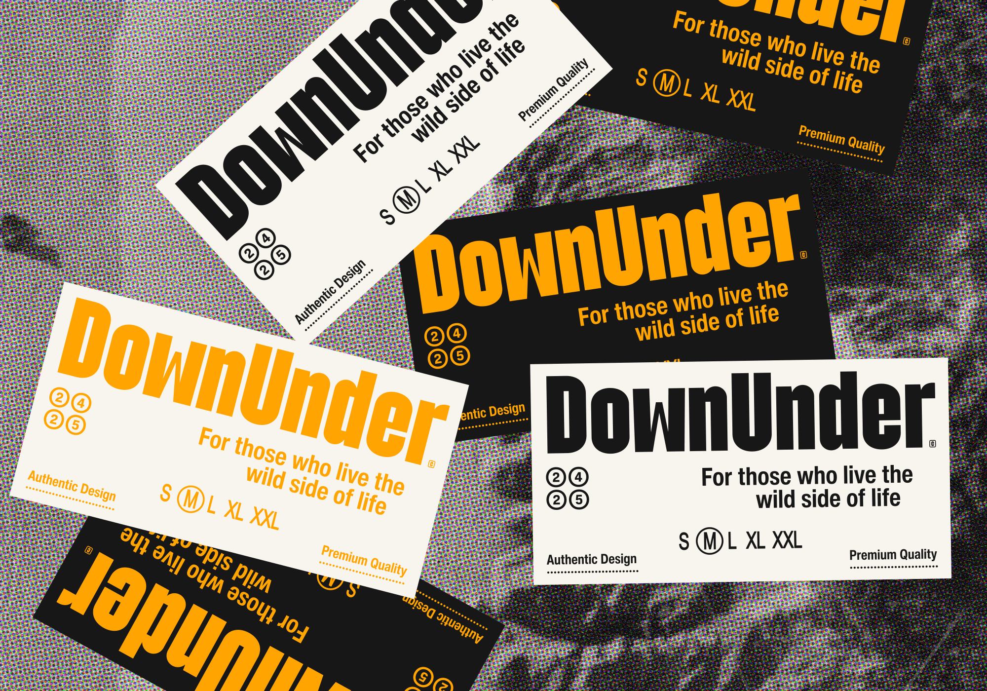
The color palette was inspired by Australia’s natural landscapes. Earthy tones of brown, beige, and golden yellow were chosen for their connection to the outback, while coral and green from the secondary palette brought vibrancy and versatility. These colors create a cohesive yet dynamic identity that adapts seamlessly across diverse touchpoints.
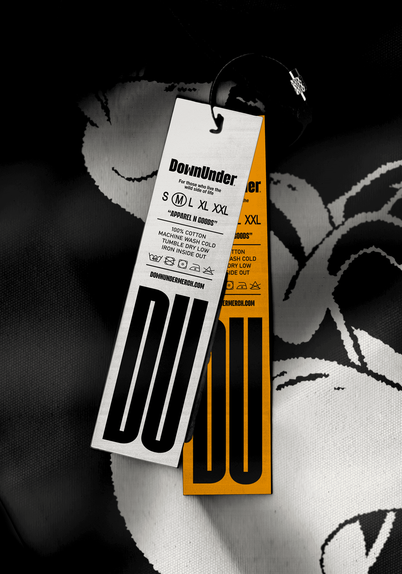
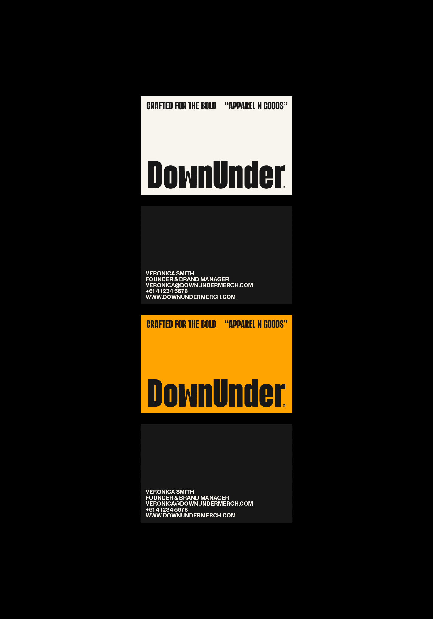
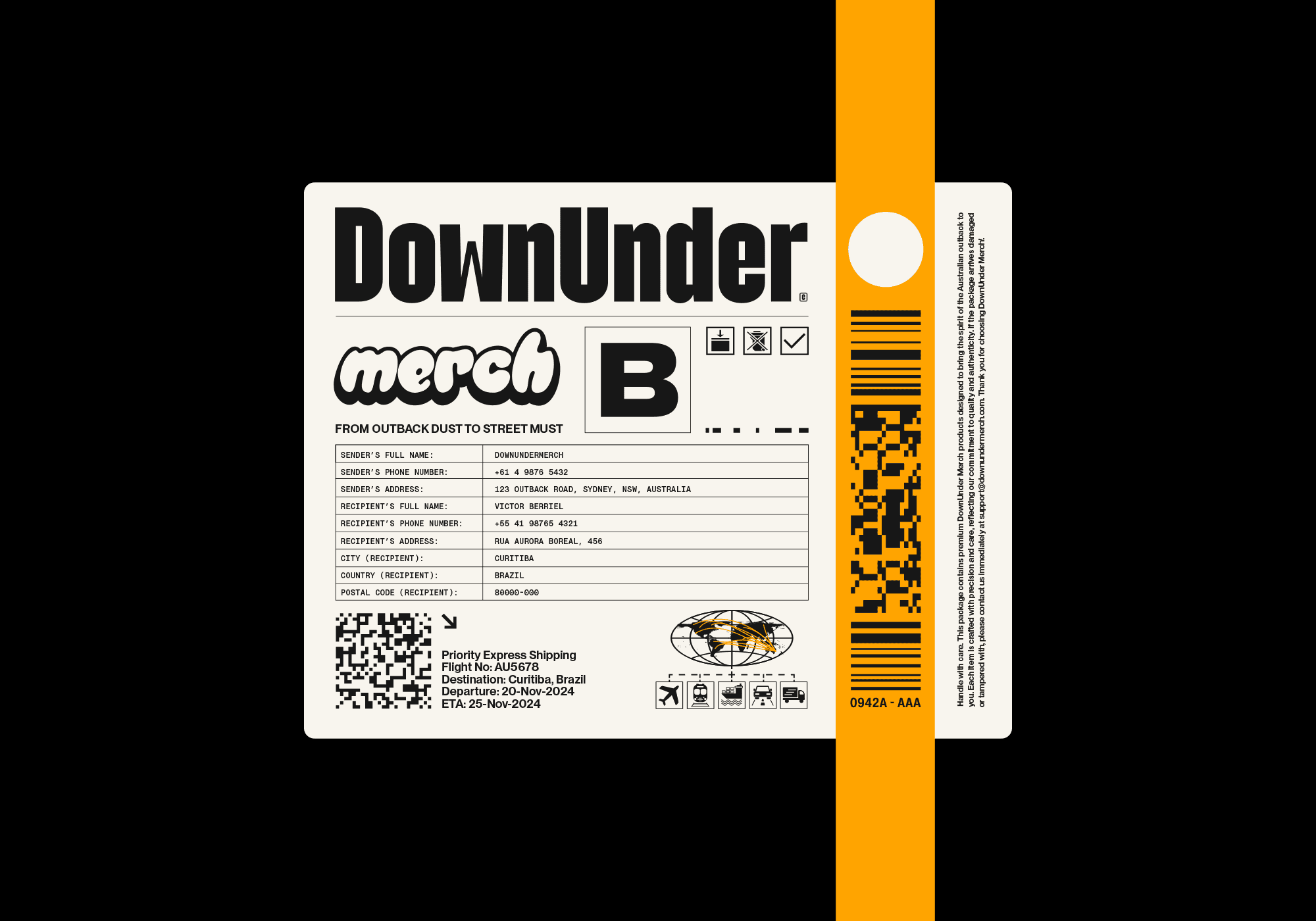
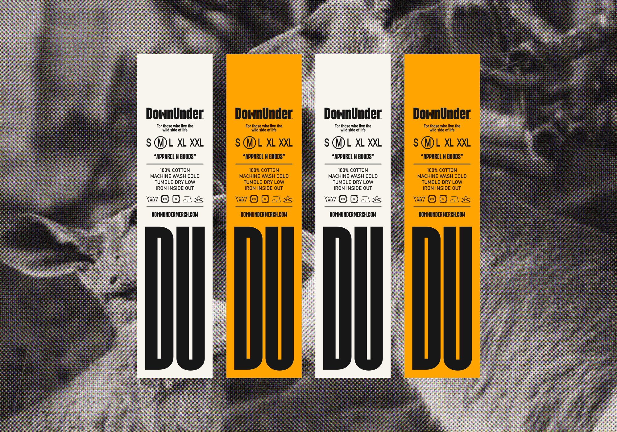
Typography played a pivotal role in shaping the brand’s tone. The primary typeface, Biogem Bold, ensures impact and presence in titles and highlights, while Helvetica Now delivers clarity and professionalism for extended text. PP Supply Mono, a monospace typeface, adds precision and functionality for metadata and product labels.
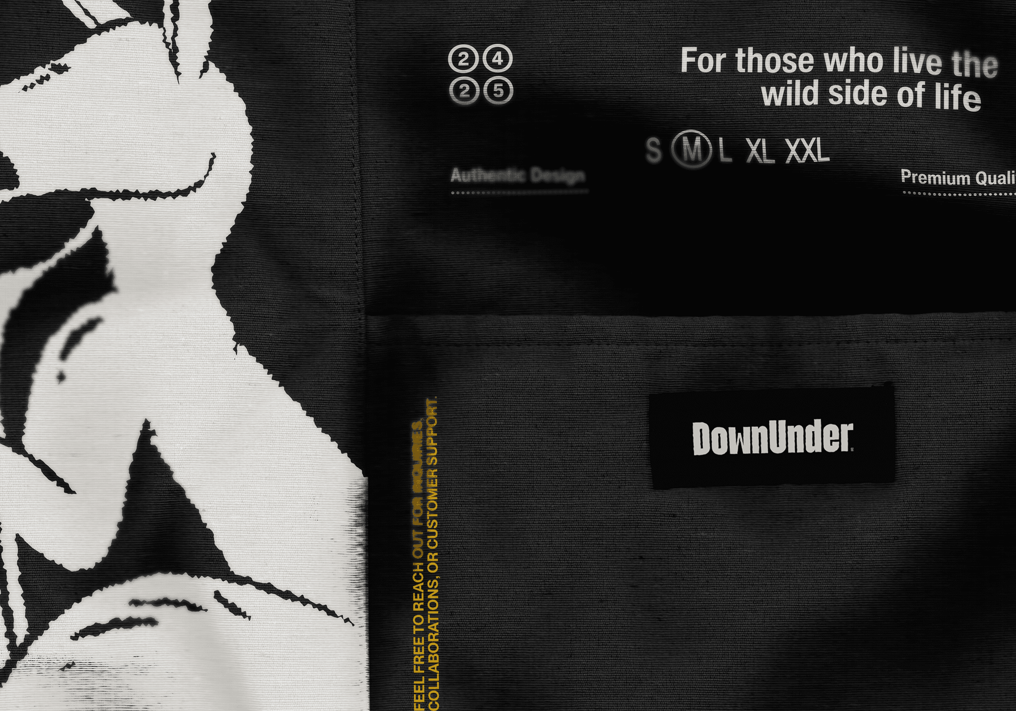
Graphic elements inspired by the brand’s adventurous ethos were integrated into the design, featuring overlays, label-like textures, and dynamic compositions. These elements bring a contemporary edge to the brand’s visual storytelling, enhancing its appeal to a younger, style-conscious audience.
The resulting identity positions DownUnder Merch as a lifestyle brand that combines the authenticity of its roots with the sophistication of a global market. The cohesive visual system enhances brand recognition, strengthens consumer trust, and lays the foundation for expansion into new products and platforms. This project showcases how strategic design can create a modern, aspirational brand identity while staying deeply connected to its heritage.
(CONTATO)
Vamos criar algo poderoso.
(CONTATO)
Vamos criar algo poderoso.
BerrielBrands
IG,
BE,
IN,
X
(CONTATO)
