Exitlag
Revolutionizing the online gaming experience with cutting-edge AI technology, empowering gamers worldwide to connect seamlessly and compete at the highest level.
Brand
Exitlag
Category
Technology
Country
Brazil
Year
2024
About Project
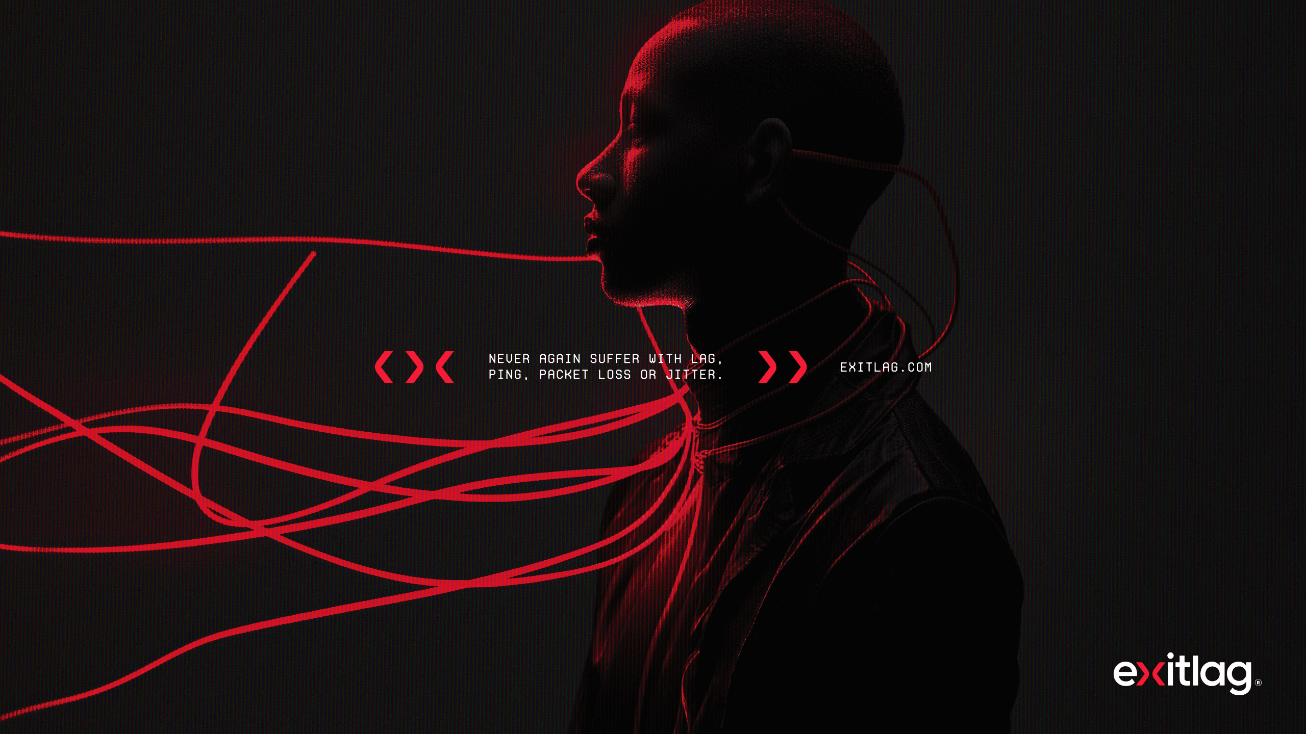
ExitLag approached us with the mission of redefining its visual identity to align with its current position as a leader in the gaming optimization industry. The objective was to modernize their brand while preserving the essence that has made ExitLag a recognized name among gamers.
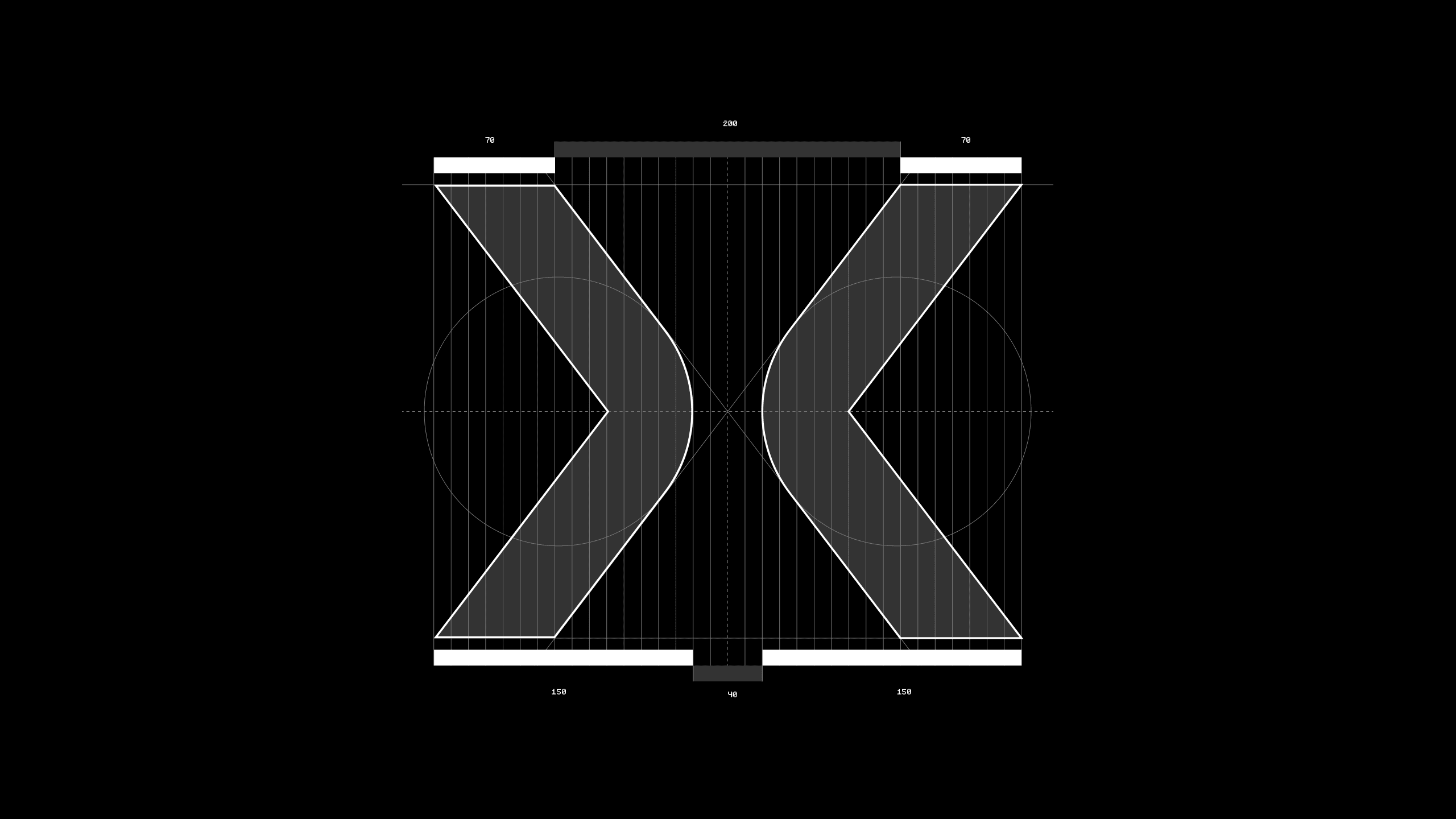
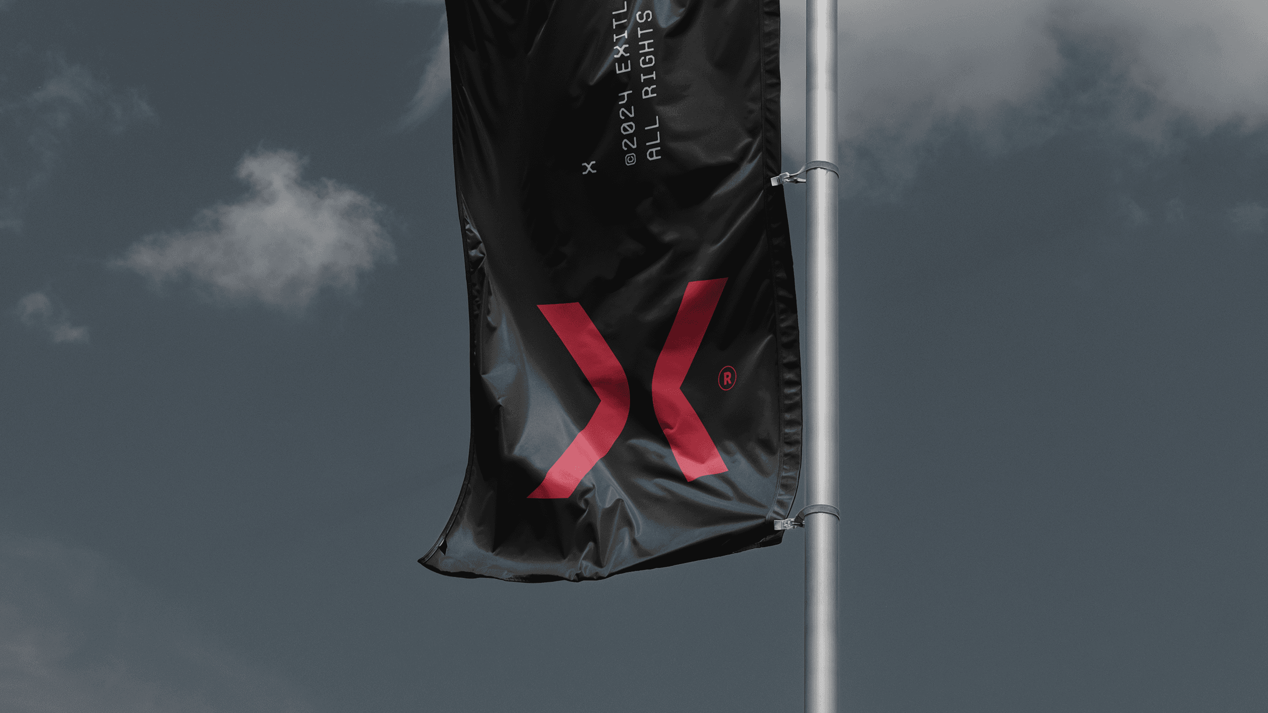
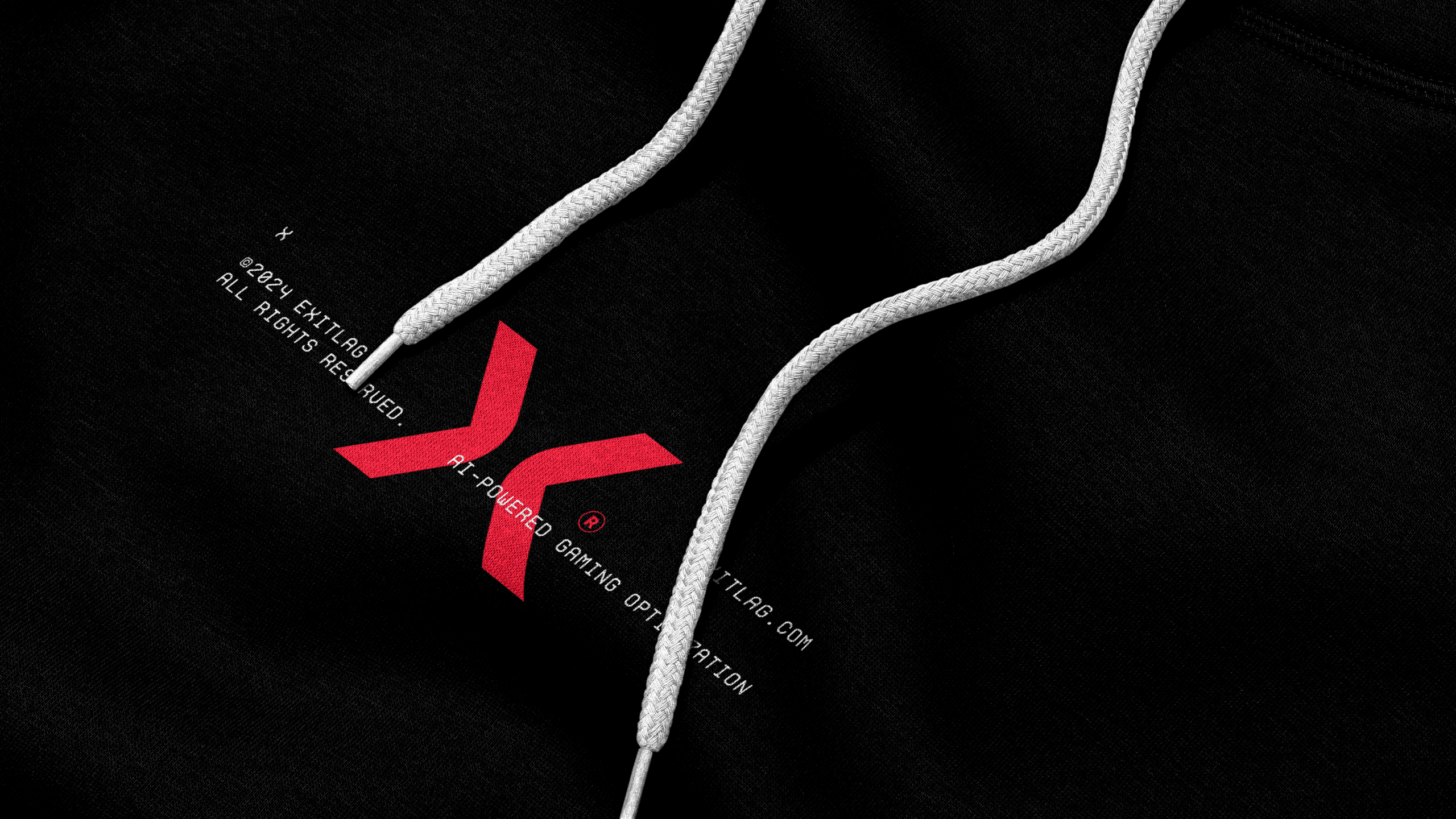
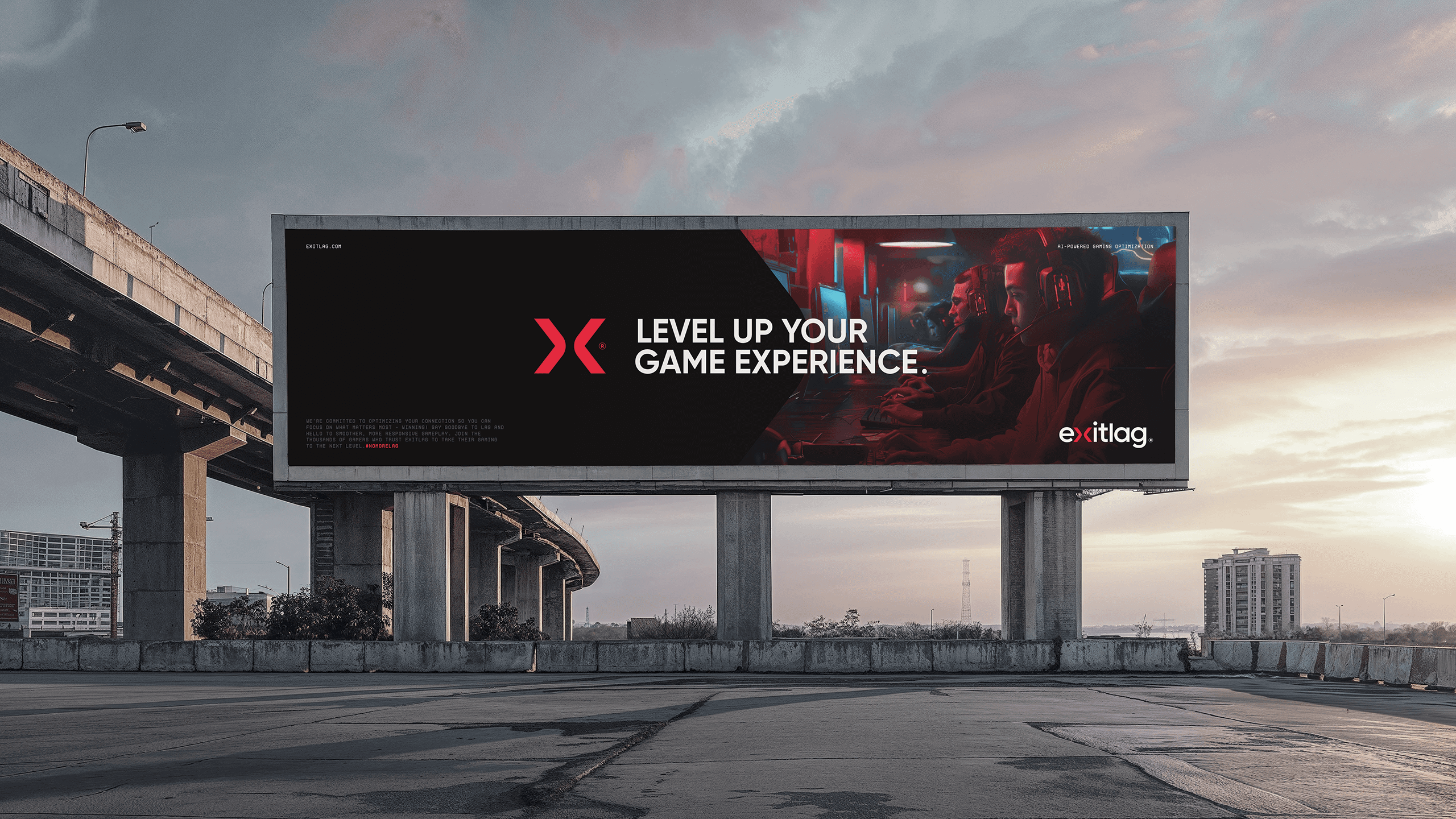
Central to the rebranding effort was the iconic “X,” reimagined to embody simplicity, boldness, and innovation. Designed with distinct proportions, the “X” became a unique, standalone symbol, representing connection and convergence—key elements of ExitLag’s mission to bridge gamers with optimal performance worldwide. The horizontal arrows within the “X” create a visual narrative of direction and flow, symbolizing seamless connections and the elimination of lag.
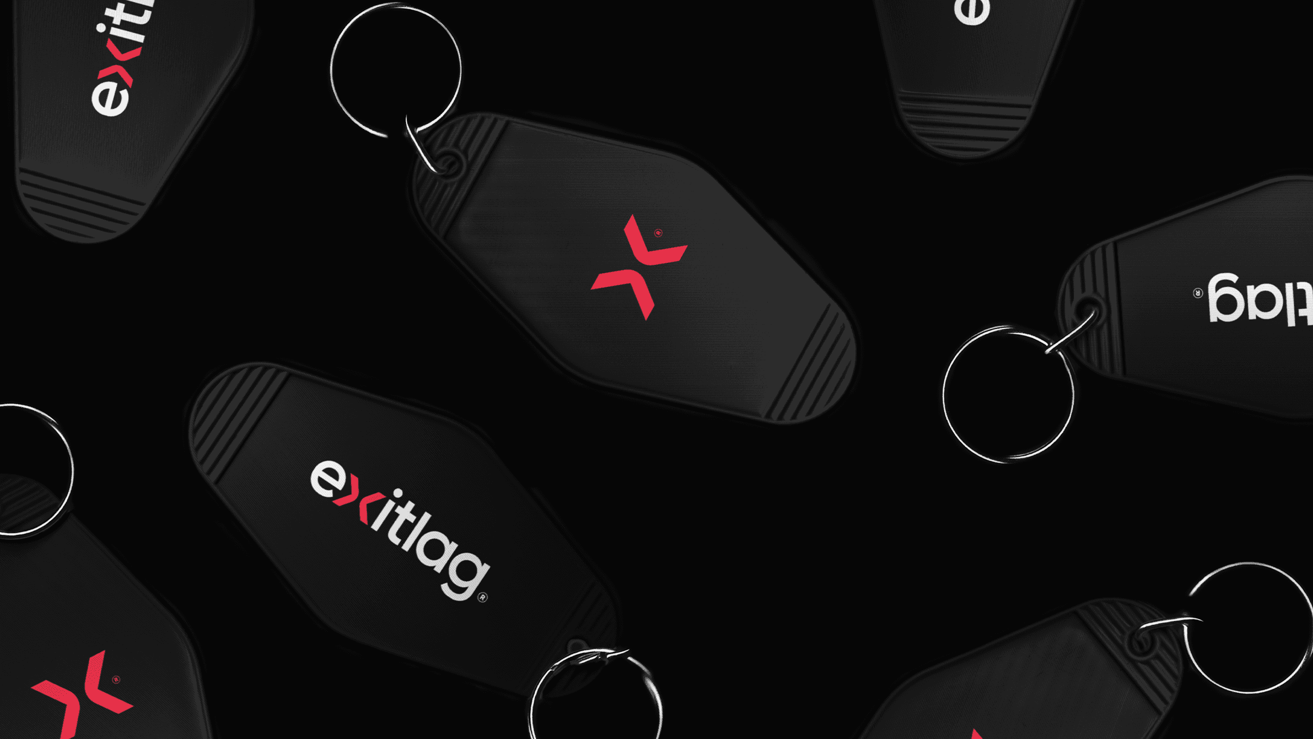
The typographic approach emphasized a contemporary sans-serif font in lowercase, enhancing clarity and approachability. The lowercase style projected a more modern, accessible, and user-friendly image, making the brand resonate with its tech-savvy audience. The refined color palette introduced a sleek, energetic aesthetic, blending dynamic red accents with clean neutrals, reinforcing the brand’s focus on precision and reliability.
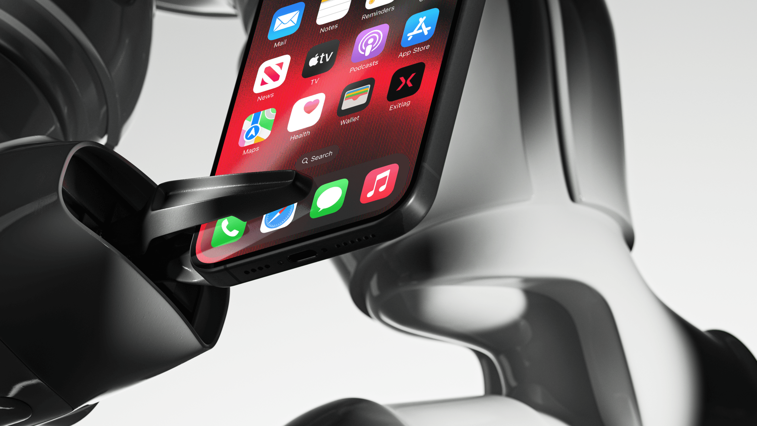
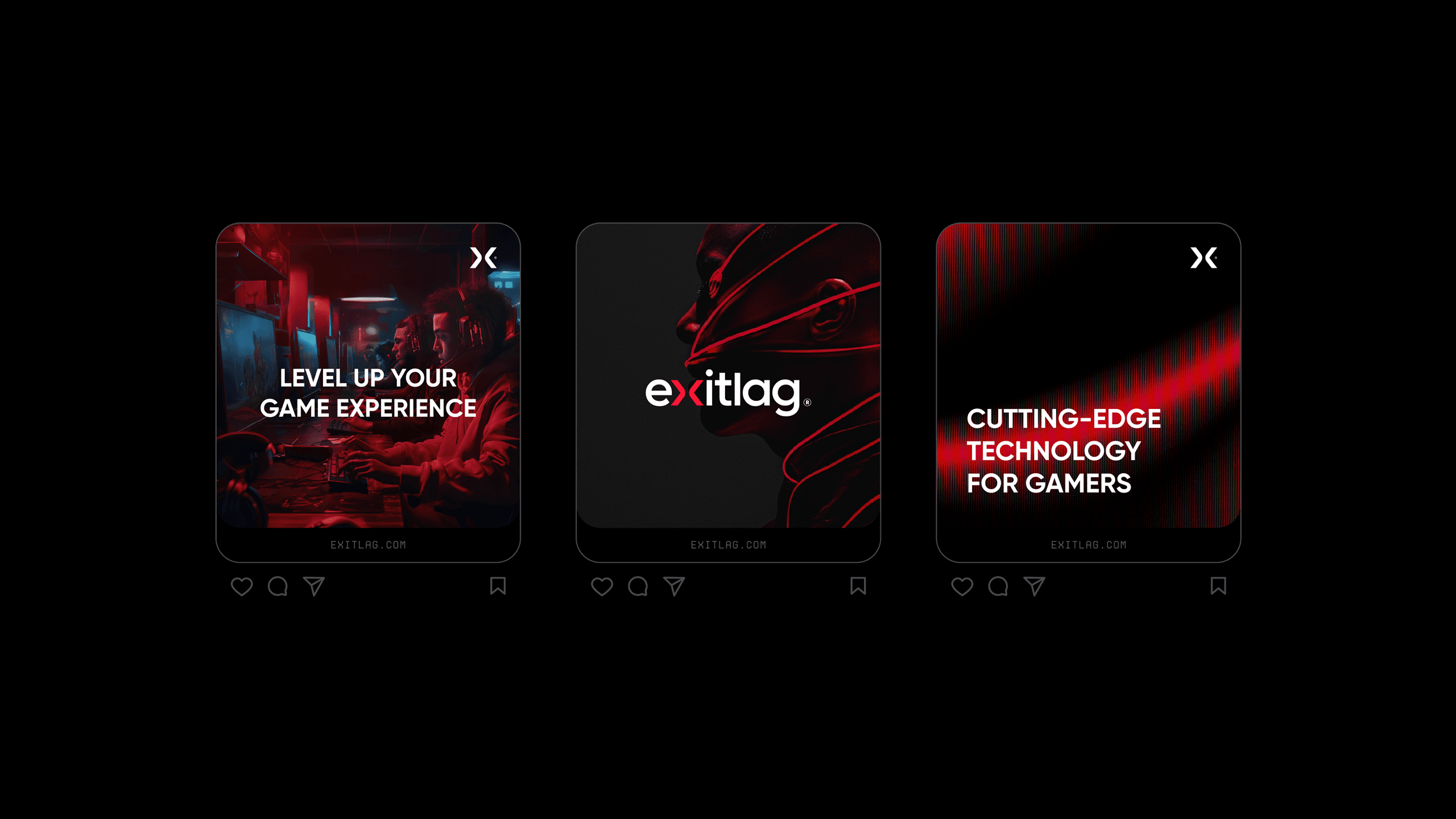
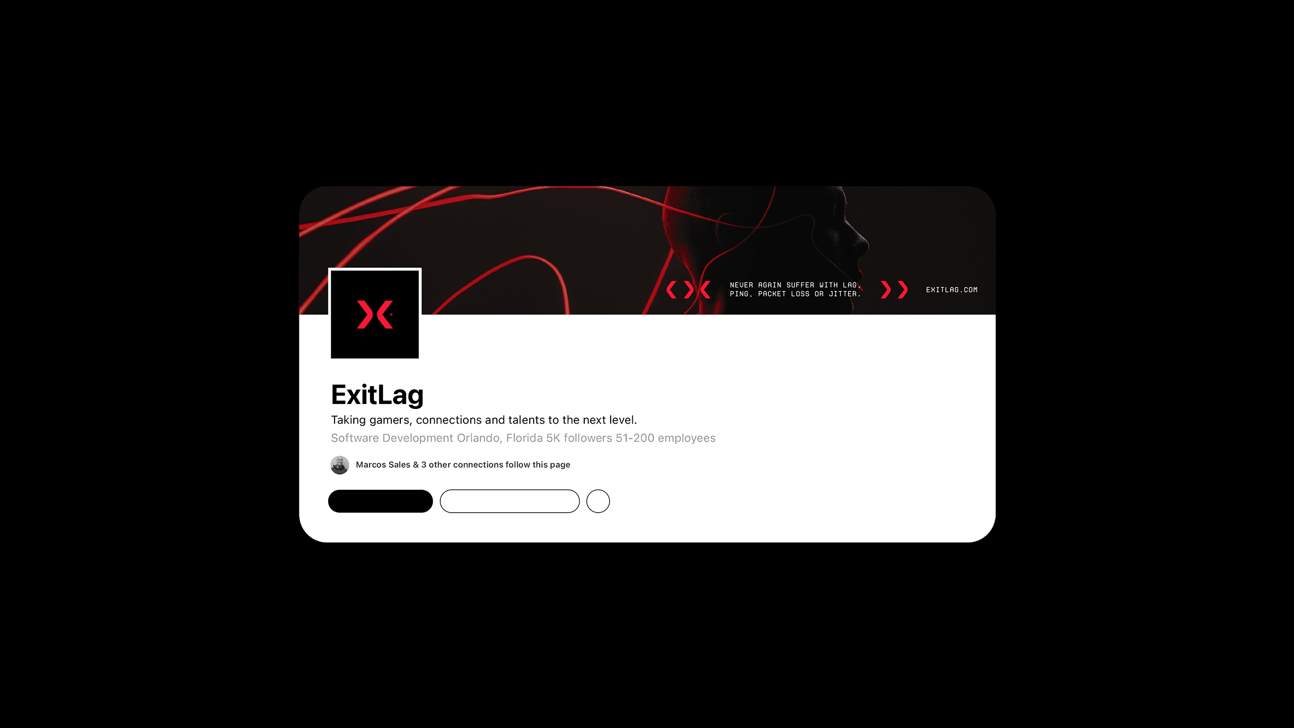
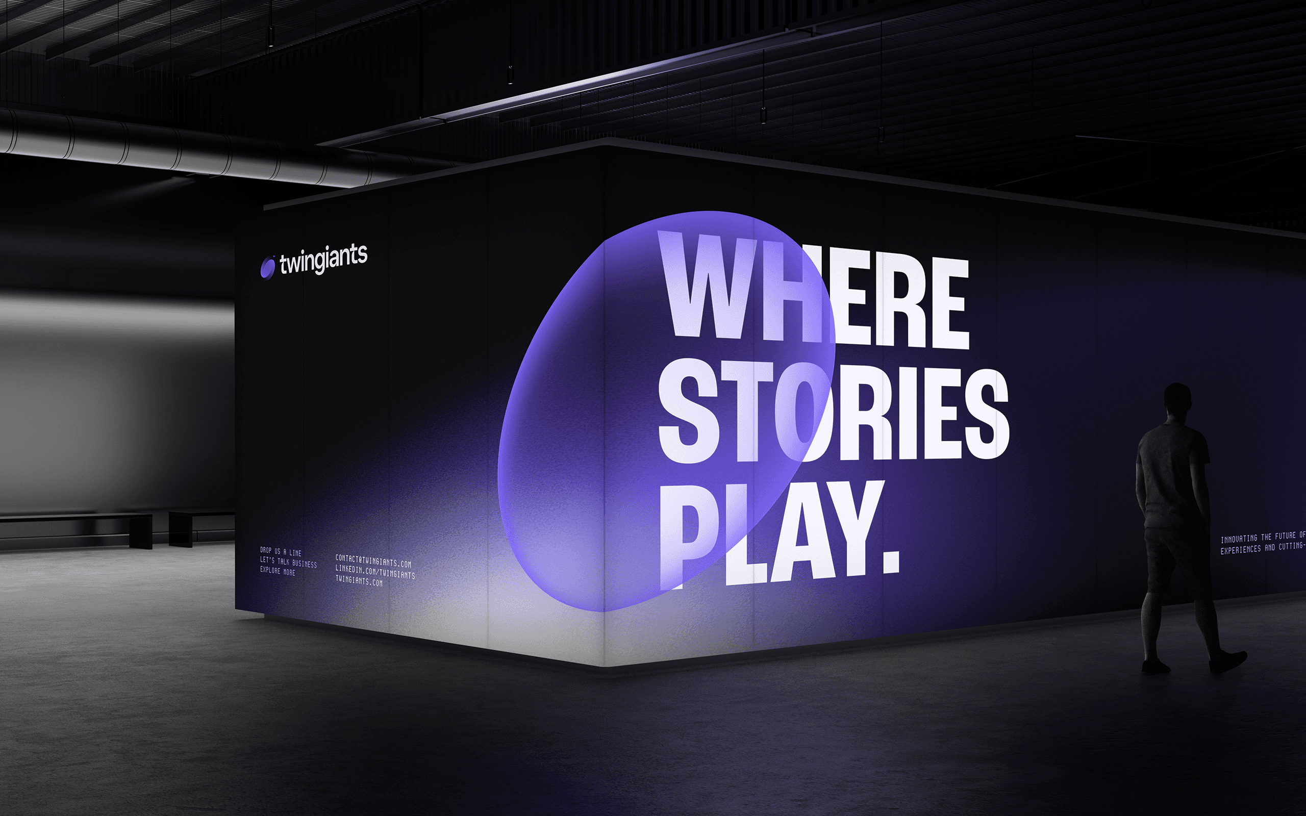
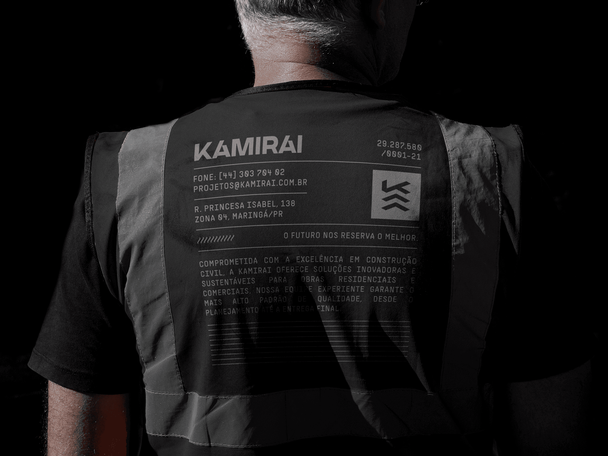
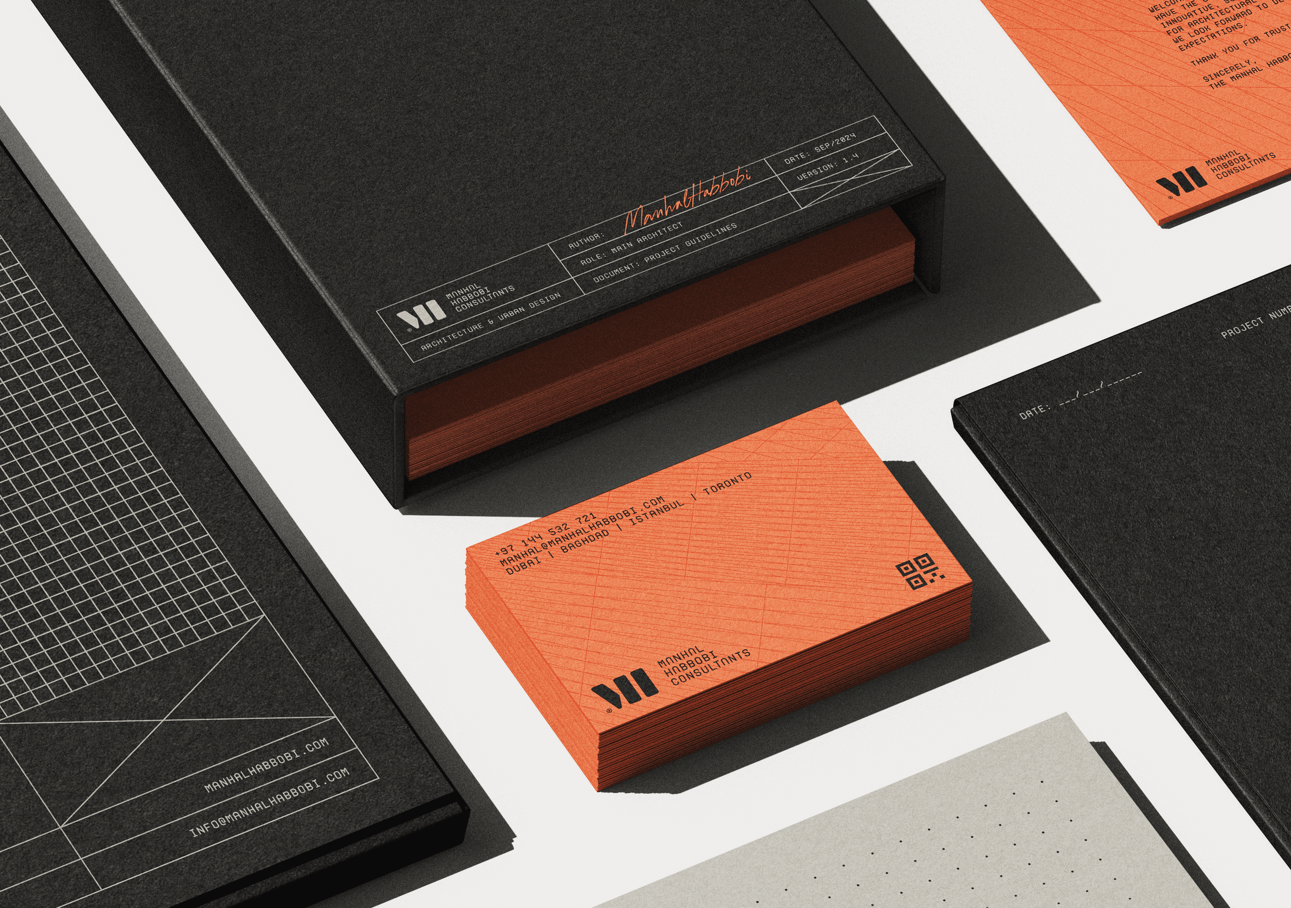
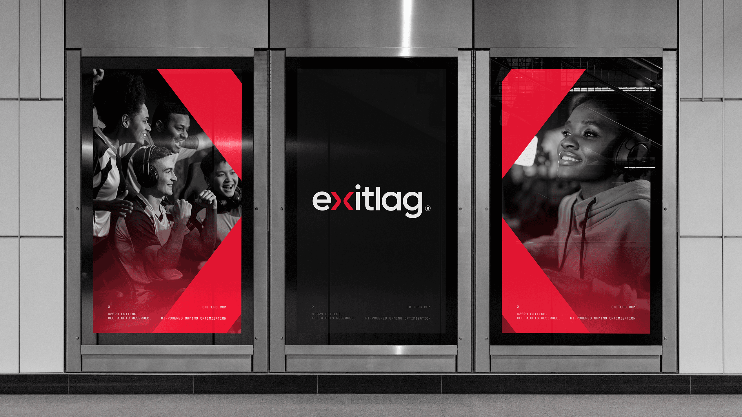
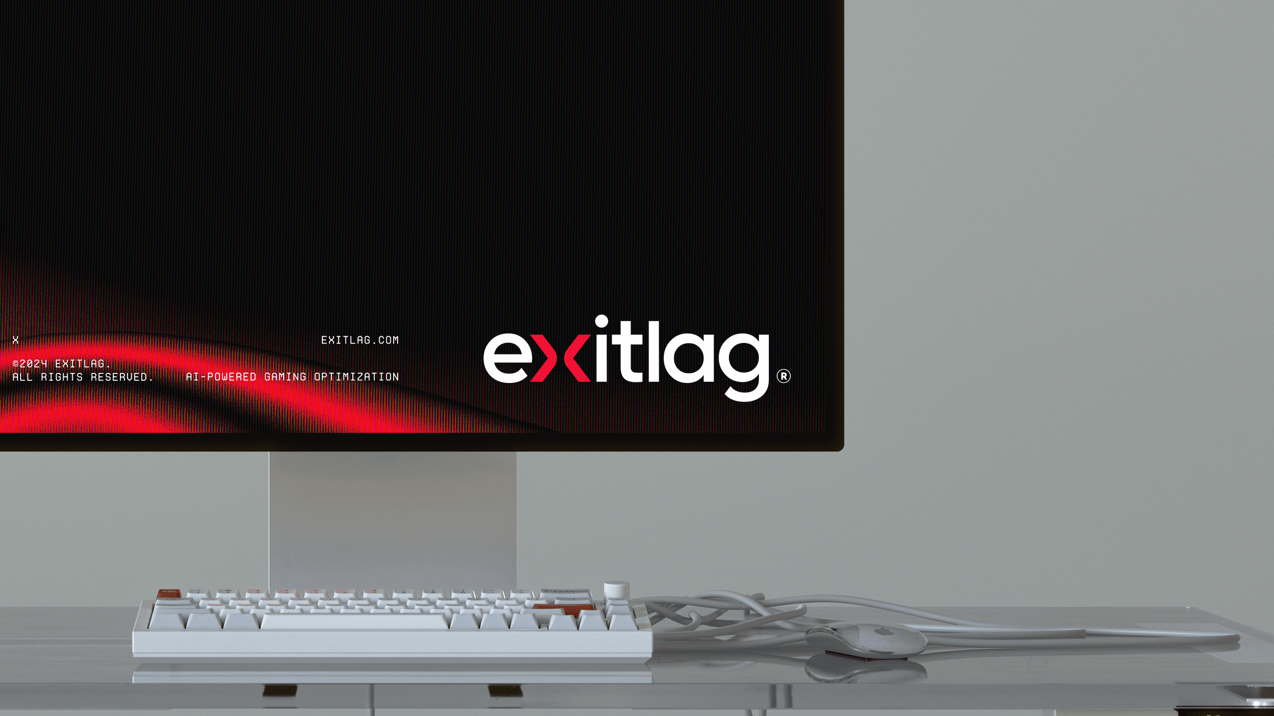
Practical application played a crucial role in the redesign. Mockups were developed to demonstrate the identity’s adaptability across digital and physical platforms, ensuring consistent performance in small and large-scale executions. From merchandise to user interfaces, the rebranding positioned ExitLag as a forward-thinking, globally competitive brand.
This rebranding project highlights ExitLag’s evolution while staying true to its roots. The result is a cohesive identity that balances technical sophistication with the dynamic energy of the gaming community.
(CONTATO)
Vamos criar algo poderoso.
(CONTATO)
Vamos criar algo poderoso.
BerrielBrands
IG,
BE,
IN,
X
(CONTATO)
